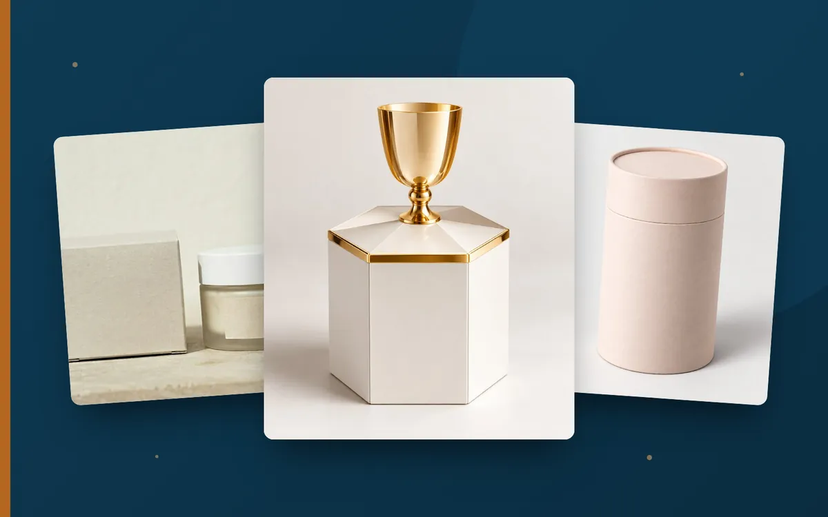
Plenty of white space, clean typography, a discreet logo. Sometimes nothing more is needed. Minimalist packaging design has been one of the most influential design trends for years. It looks modern, premium and honest. But “less” is not automatically easier. Here is what makes minimalist design and how to get it right.
What is minimalist packaging design?
Minimalism focuses on the essentials. Everything superfluous is left out, so the remaining elements have all the more impact. Typical features are:
- Plenty of free space (white space)
- Few colours, often just one or two
- Clear, legible typography
- One dominant element, such as the logo, product name or symbol
- Reduced information on the front panel
Why minimalism works so well
- Standing out through calm: on a colourful, loud shelf, clean packaging stands out.
- Premium effect: reduction is often associated with premium quality and confidence.
- Quick to grasp: fewer elements mean fewer distractions. The message gets across faster.
- Timelessness: minimalist designs date more slowly than heavily trend-driven designs.
- Sustainable feel: little ink and natural materials underline a responsible image.
How material and finishing make the difference
In minimalist design, the material takes centre stage. Because there are few graphic elements, surface and feel stand out all the more:
- Kraft board: a natural look that needs little ink
- Textured or through-dyed papers: impact through material alone
- Blind embossing: a logo you can only feel looks elegant and understated. More in our article Raised varnish and embossing.
- A single hot foil accent: gold lettering on a matt base sends a strong signal.
- Soft-touch: the velvety surface makes the reduction tangible.
Common mistakes
- Boring instead of reduced: minimalism needs a strong central element, otherwise the packaging looks empty.
- Missing information: mandatory details and important product information must still be there. They belong, well designed, on the back or side panels.
- Type too small: only what stays legible is elegant.
- Lack of differentiation: in product families, variants must be clearly distinguishable, for example through accent colours.
- Poor workmanship: with little design, every flaw is immediately noticeable, from untidy edges to colour deviations.
Who is minimalism suitable for?
Minimalist design suits cosmetics, fashion, technology, premium food and brands with a sustainable focus particularly well. For products that need a lot of explanation or deliberately present themselves as playful, a reduced approach with targeted accents is often a better solution than radical minimalism.
Less ink, more impact and often lower costs
Fewer colours can save printing costs, and so can targeted rather than all-over finishes. At the same time, flawless execution is important. Colour accuracy and clean workmanship are especially crucial in minimalist design. More in our article How is perfect print quality achieved?.
Planning minimalist packaging? We will advise you on material, finishing and implementation. Order our free sample pack. You will receive a binding quote within 24 hours.
Request a quote →